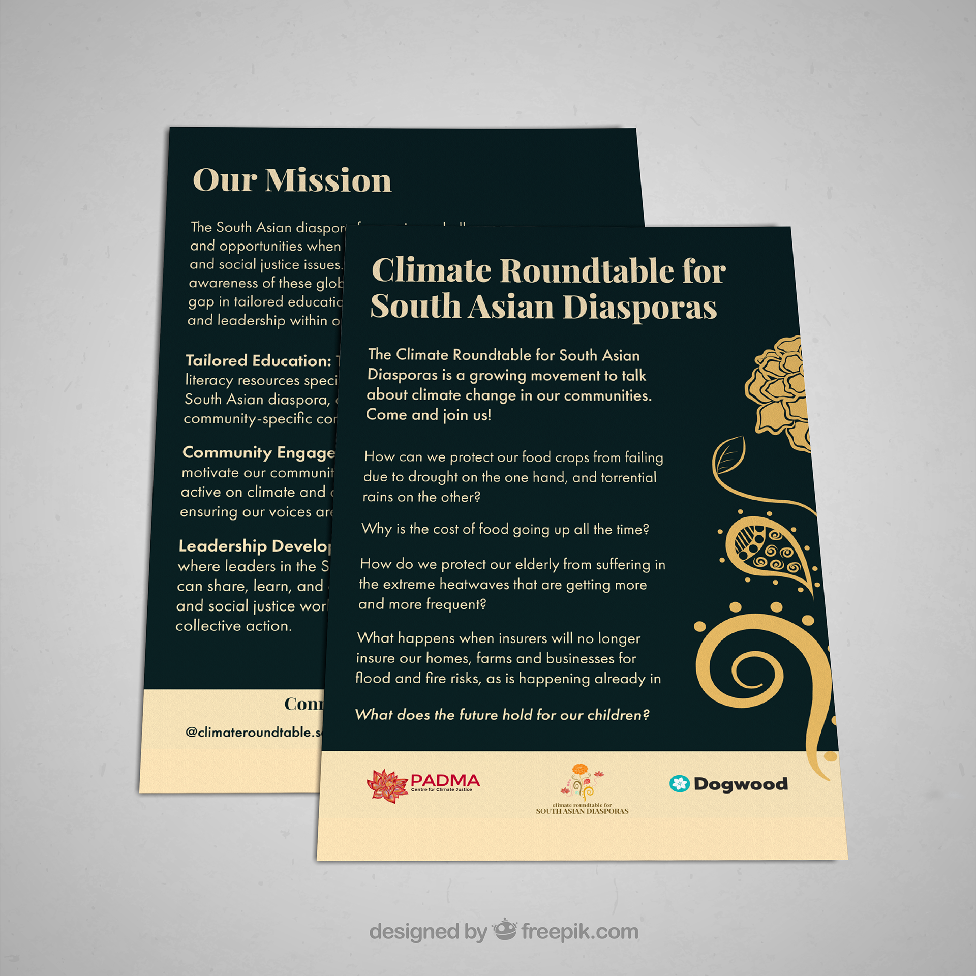
Flyers promoting launch of organization, "Climate Roundtable for South Asian Diasporas".
Softwares: Adobe Illustrator, Canva
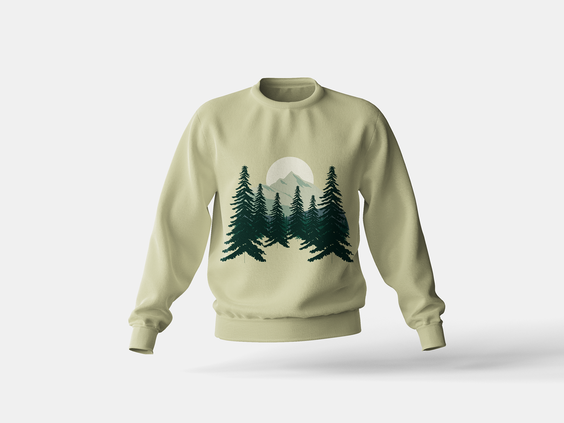
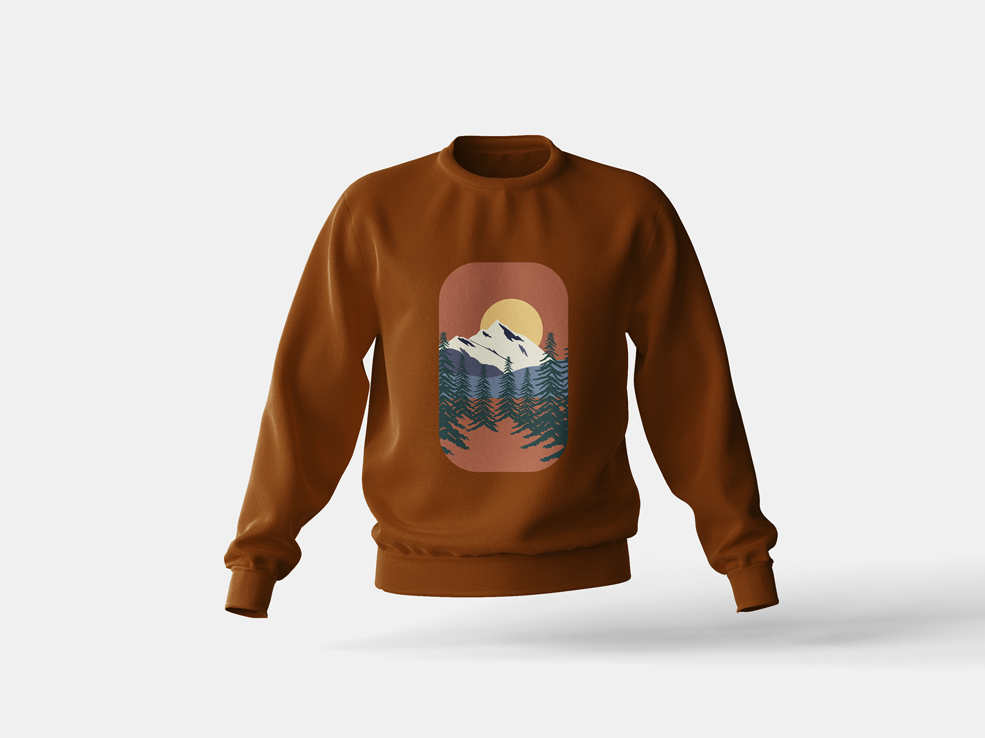
Sweatshirt Merch
Softwares: Adobe Photoshop, Adobe Illustrator
Invitation Graphic
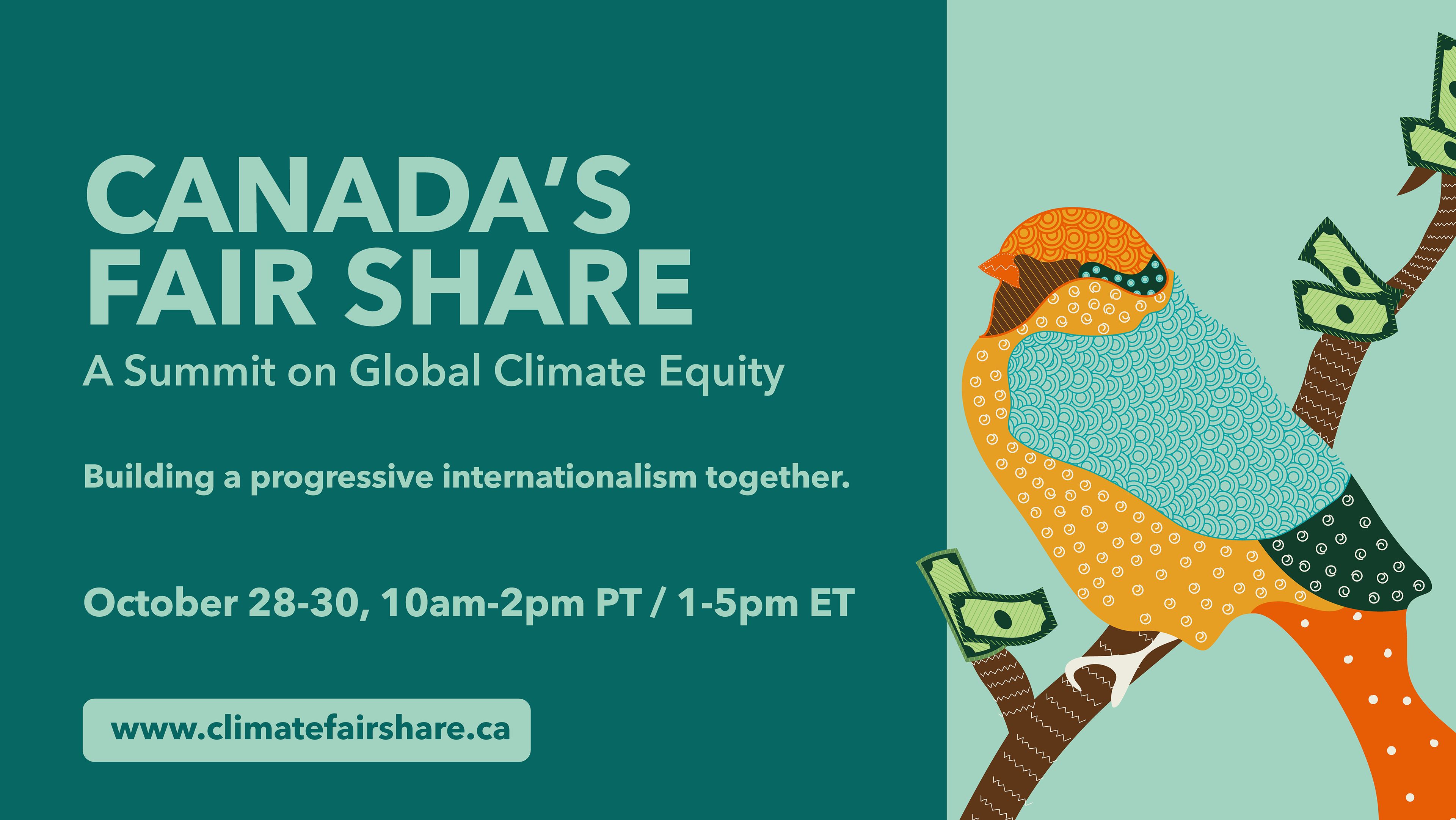
Designed to promote a virtual summit.

Website Banner
Notebook and Pen Sticker