Introduction
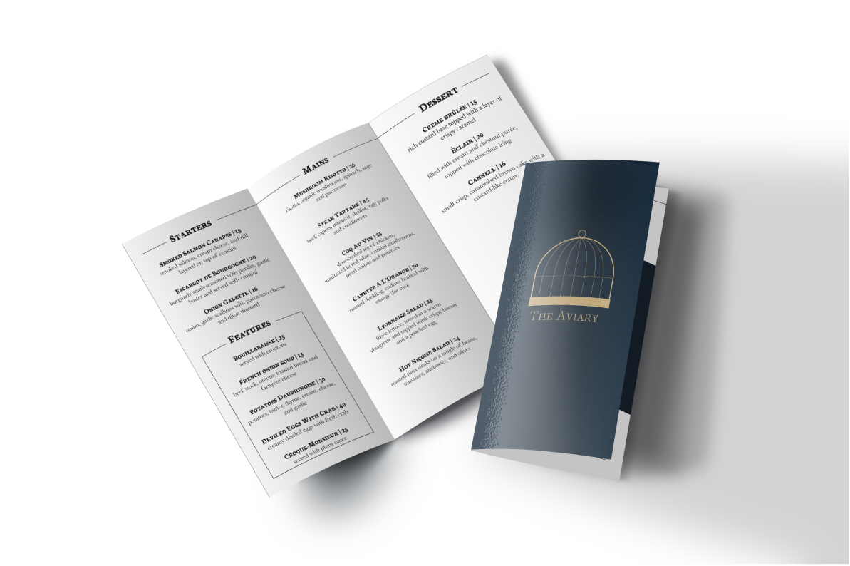
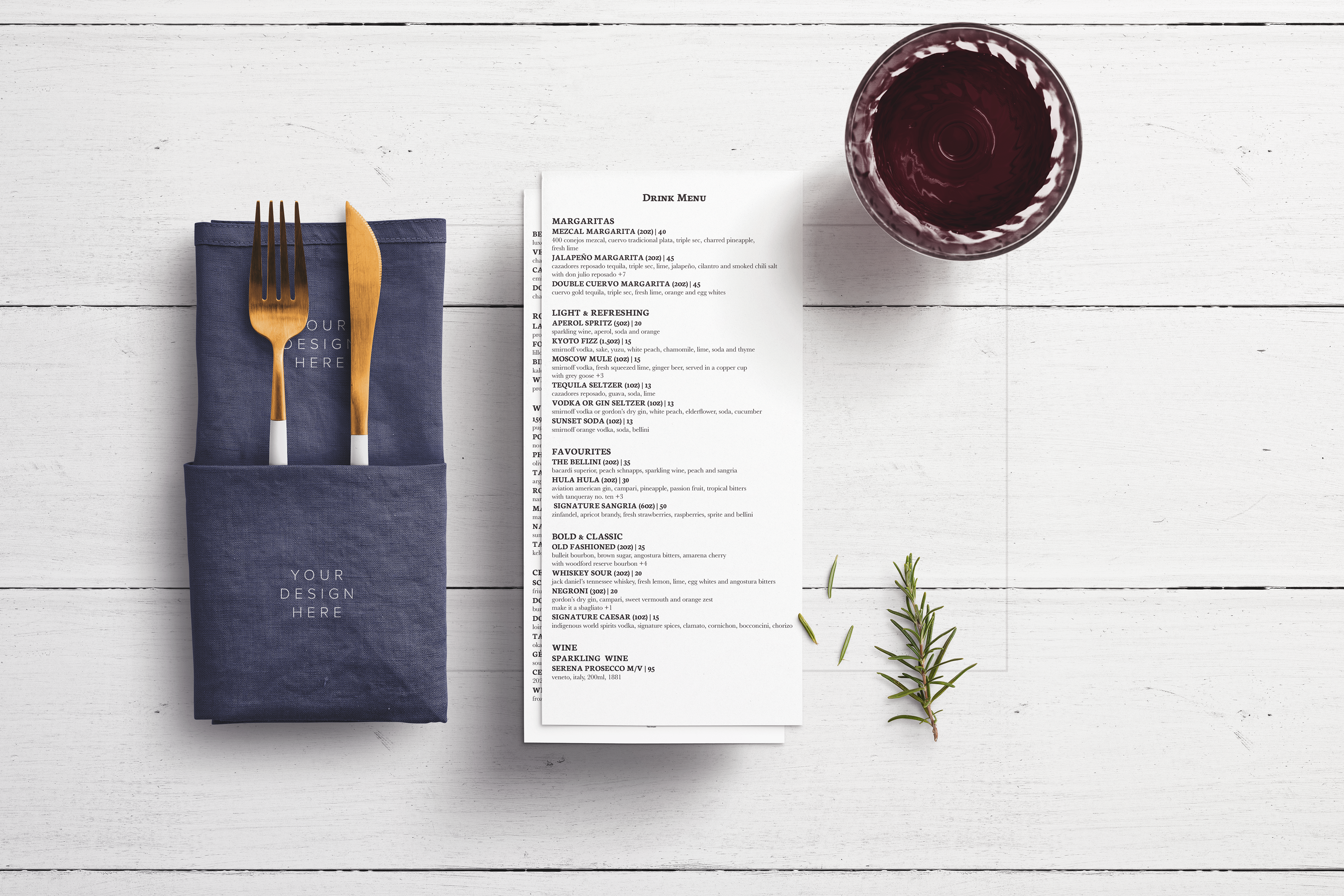
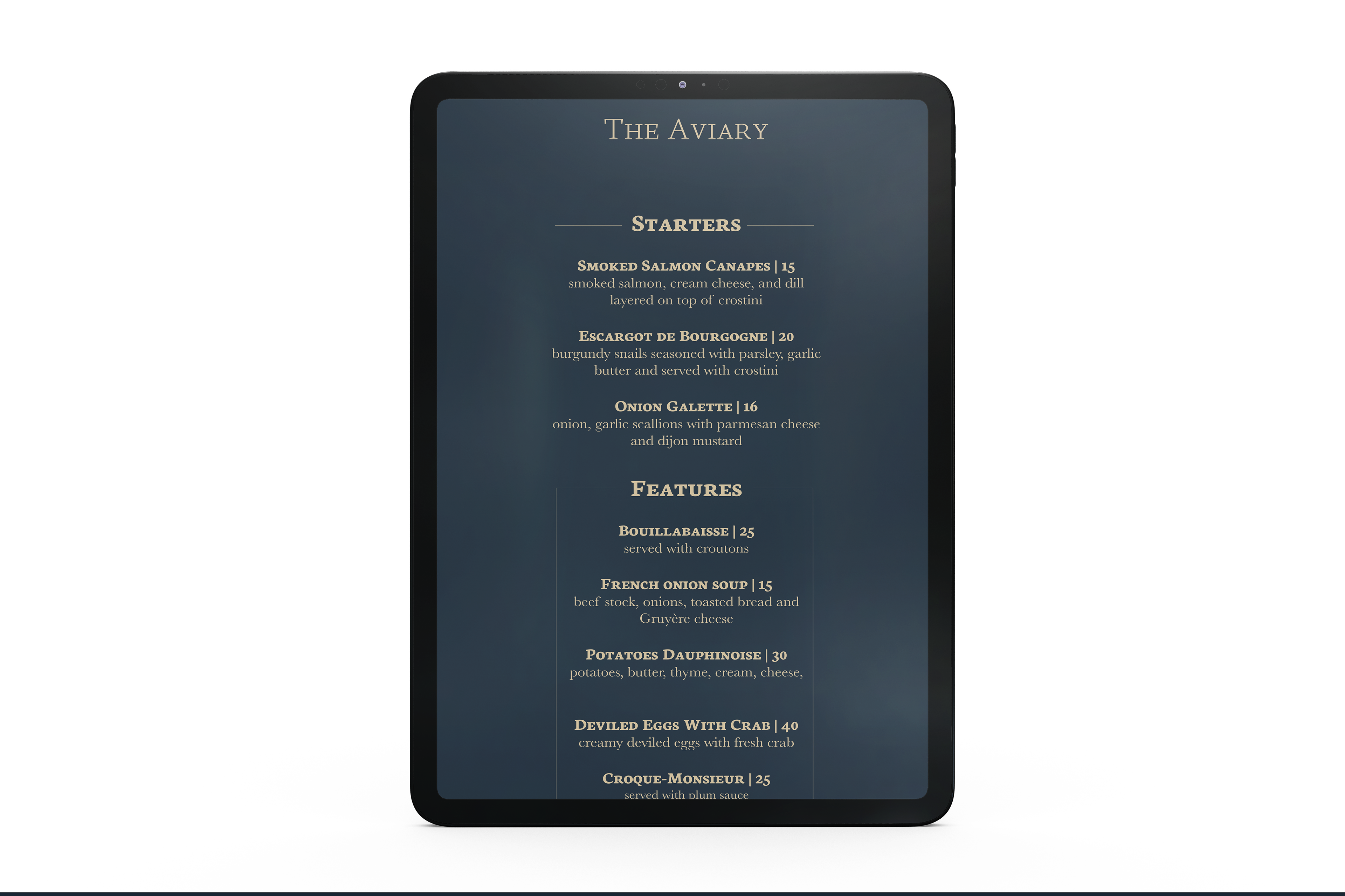
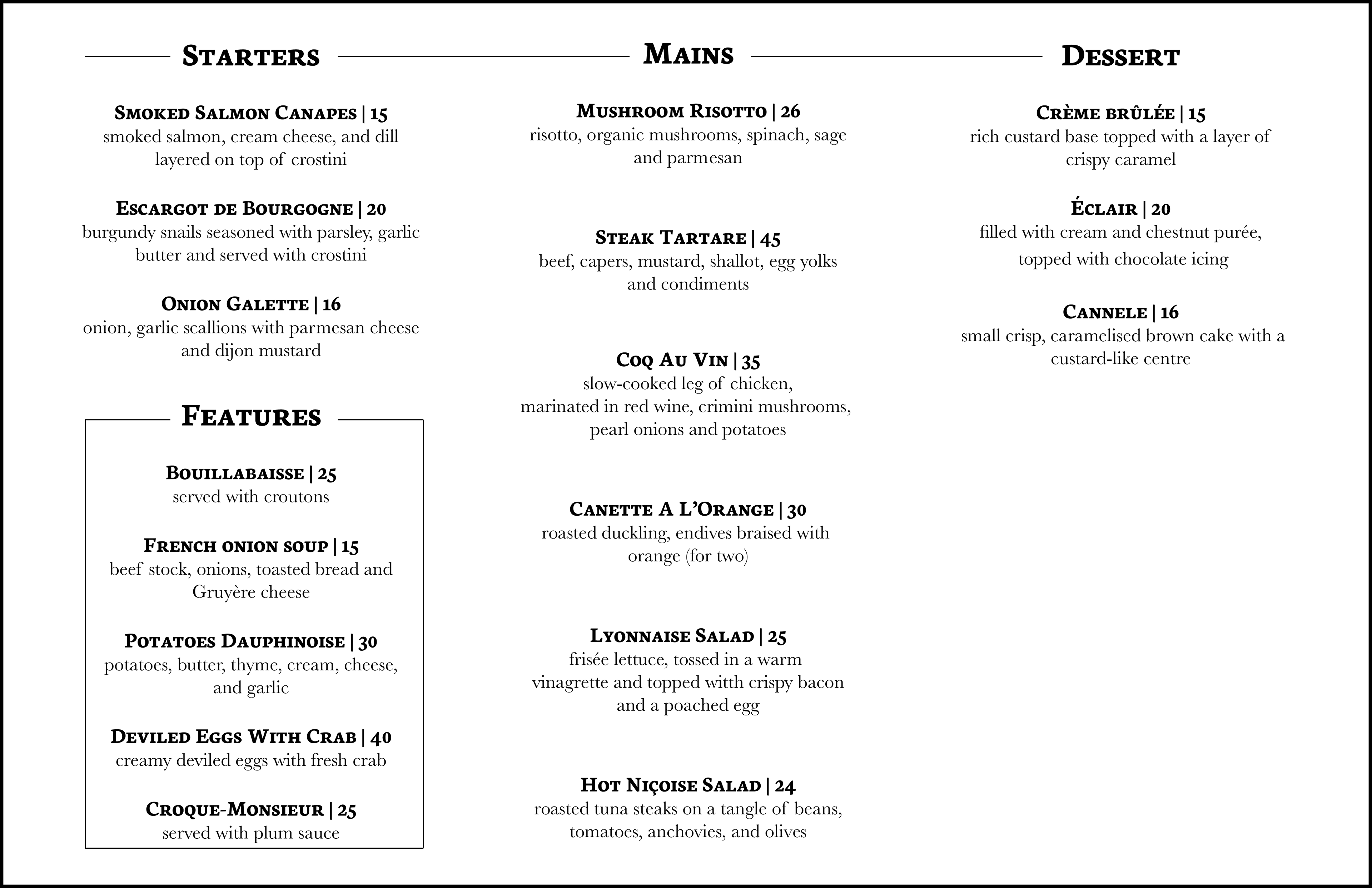
The Aviary is a French-inspired restaurant in Vancouver. The menu consists of 3 starters and desserts, 5 features, and 6 mains. The drink menu consists of 40 drinks. There is also an iPad version. The colours used for this design are deep blue and elements of gold. The serif fonts, “Baskerville” and “Neuton SC” were chosen for this design. The softwares Illustrator and InDesign were used for the layouts and Photoshop was used for the mockups.
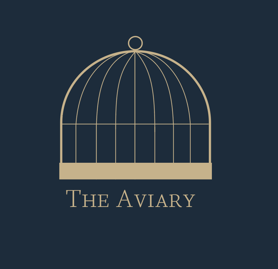
Logo
Since the aviary means "bird cage", the logo is of a bird cage as well. The gold is meant to symbolize luxury, excellence, and extravagance since this is supposed to be a fancy restaurant.
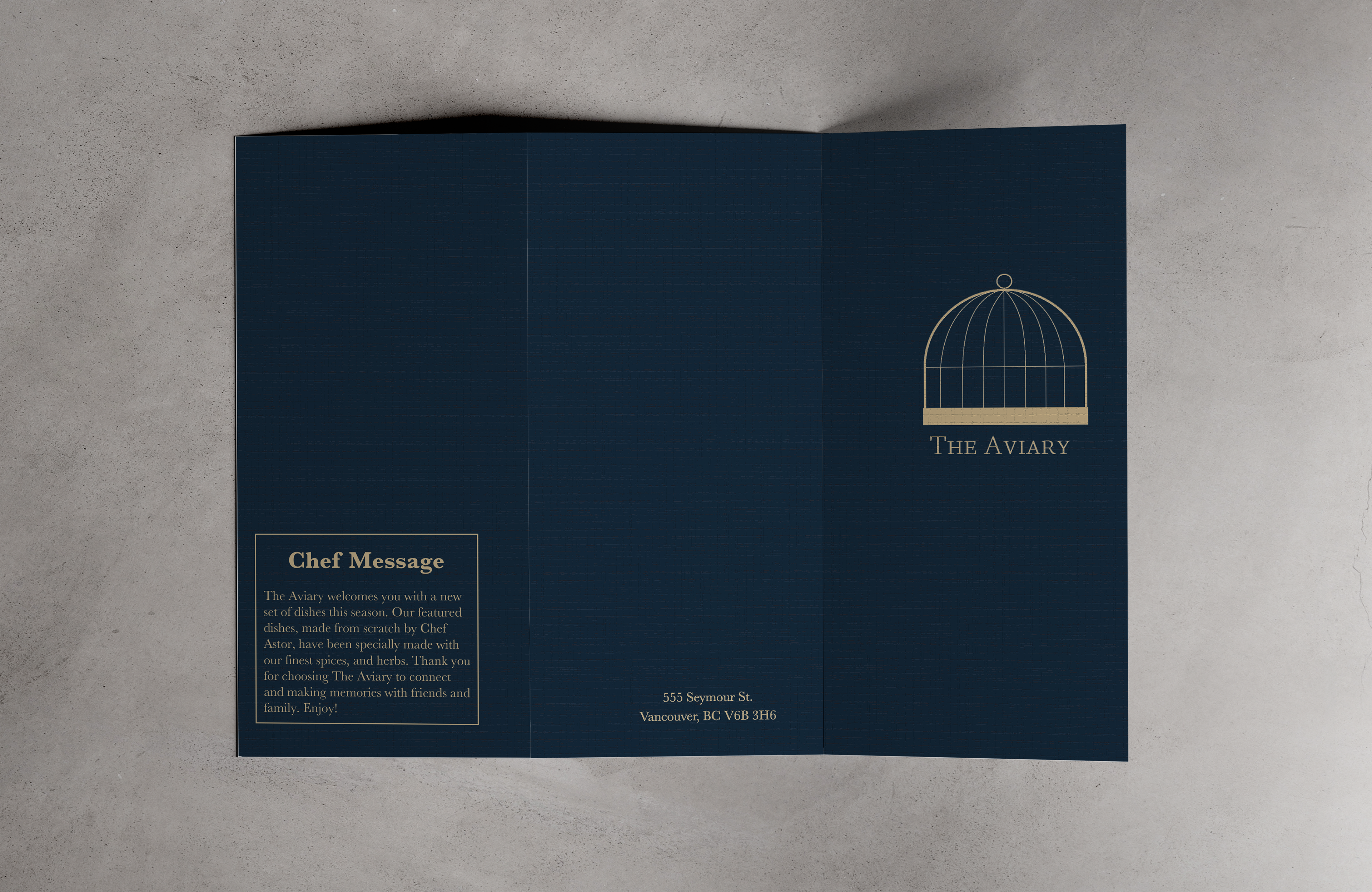
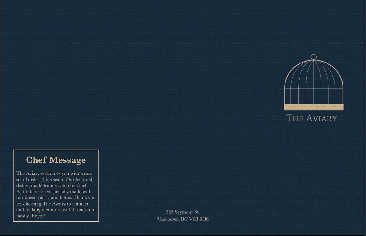
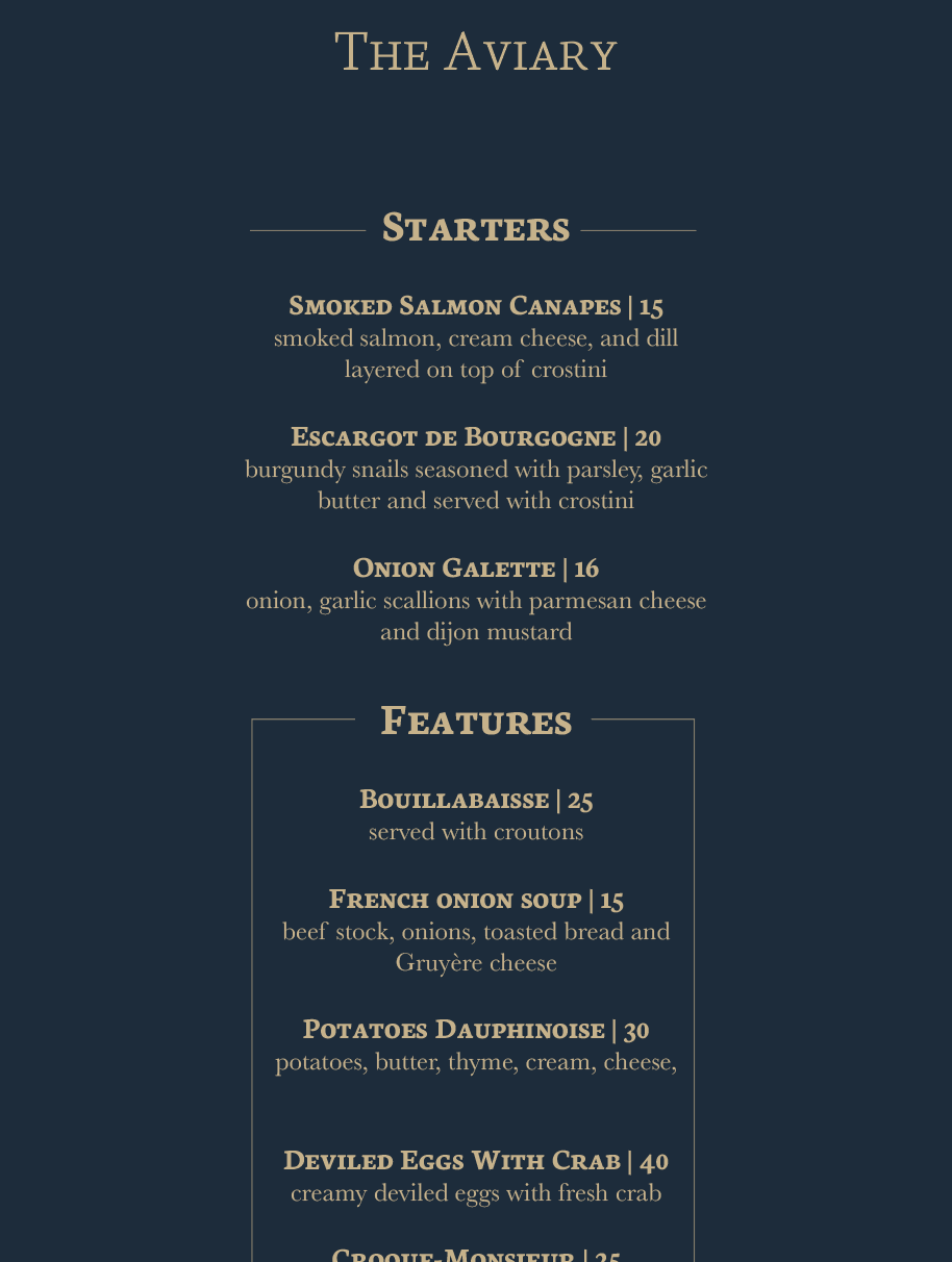
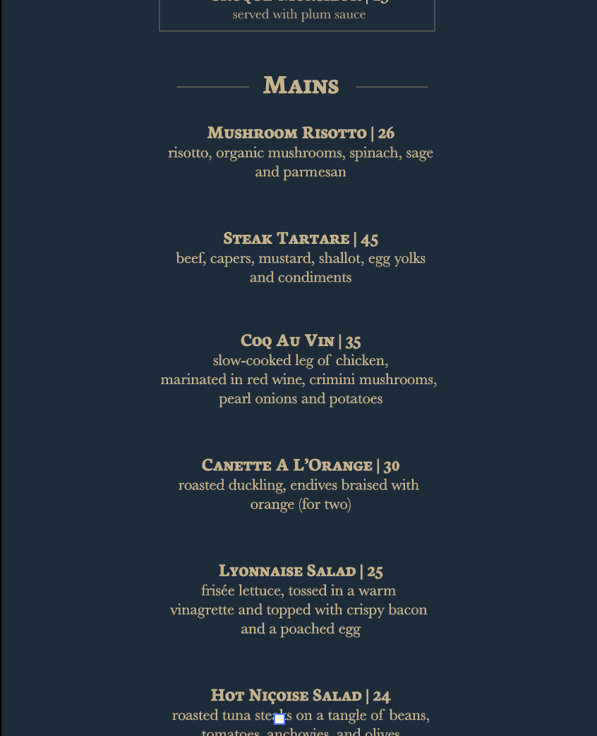
Cover + Menu - 17 x11 in
The cover is consistent with the iPad version to maintain the brand's aesthetic. The gold and blue compliment each other to create a lavish and elegant appearance. The typography is the main design of the menu inside with a line across the top that is framing the titles and a border around the "Features" to showcase that these are the special dishes.
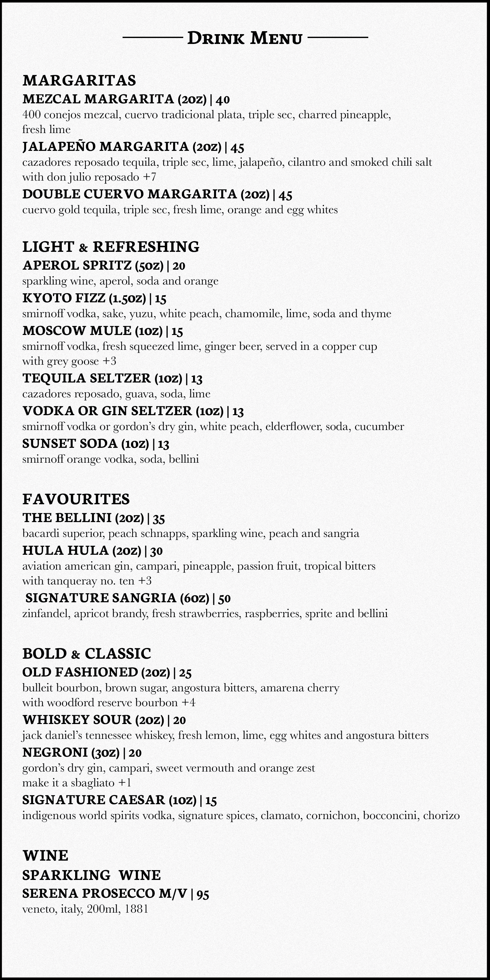
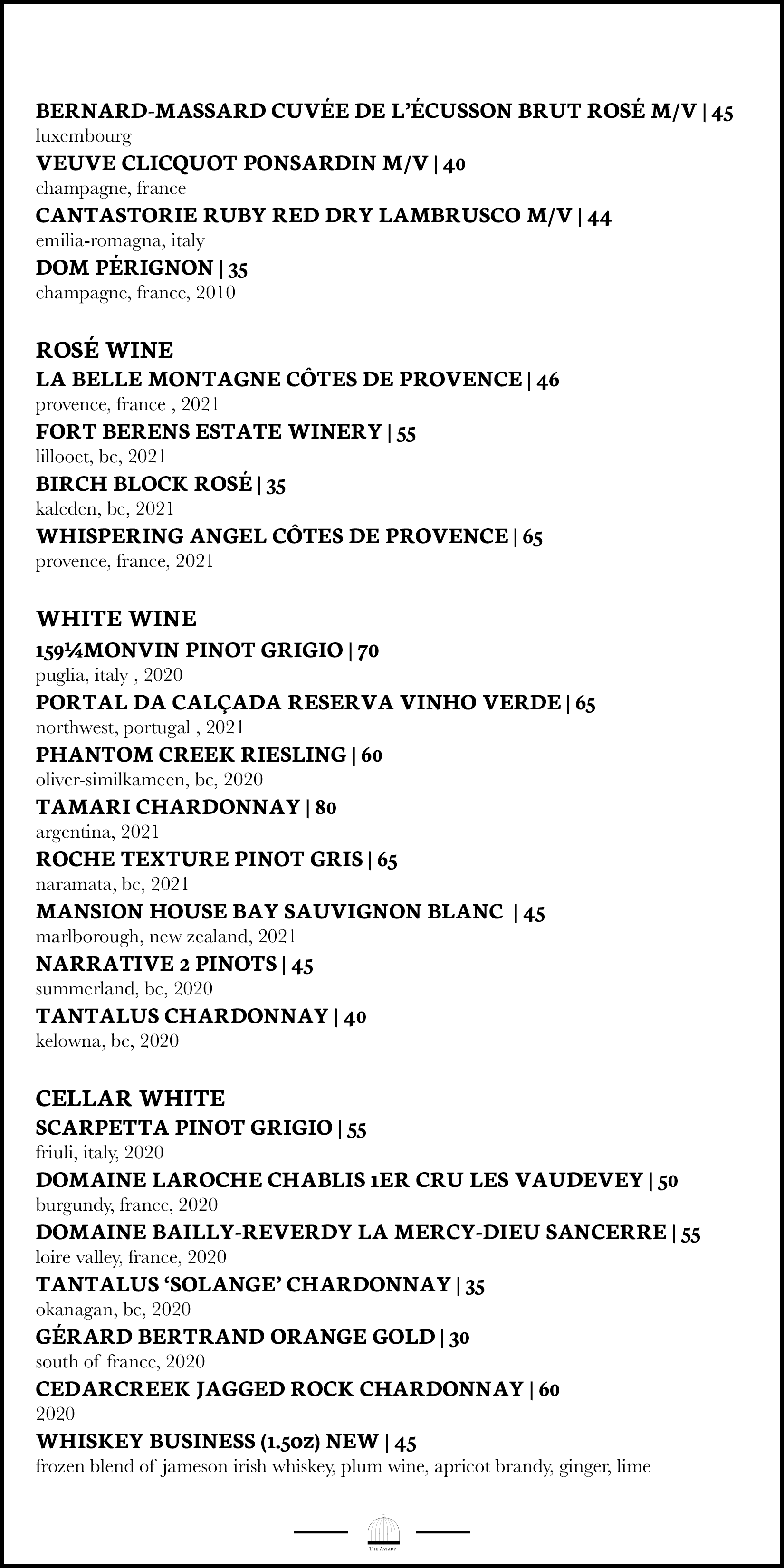
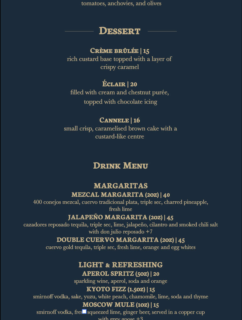
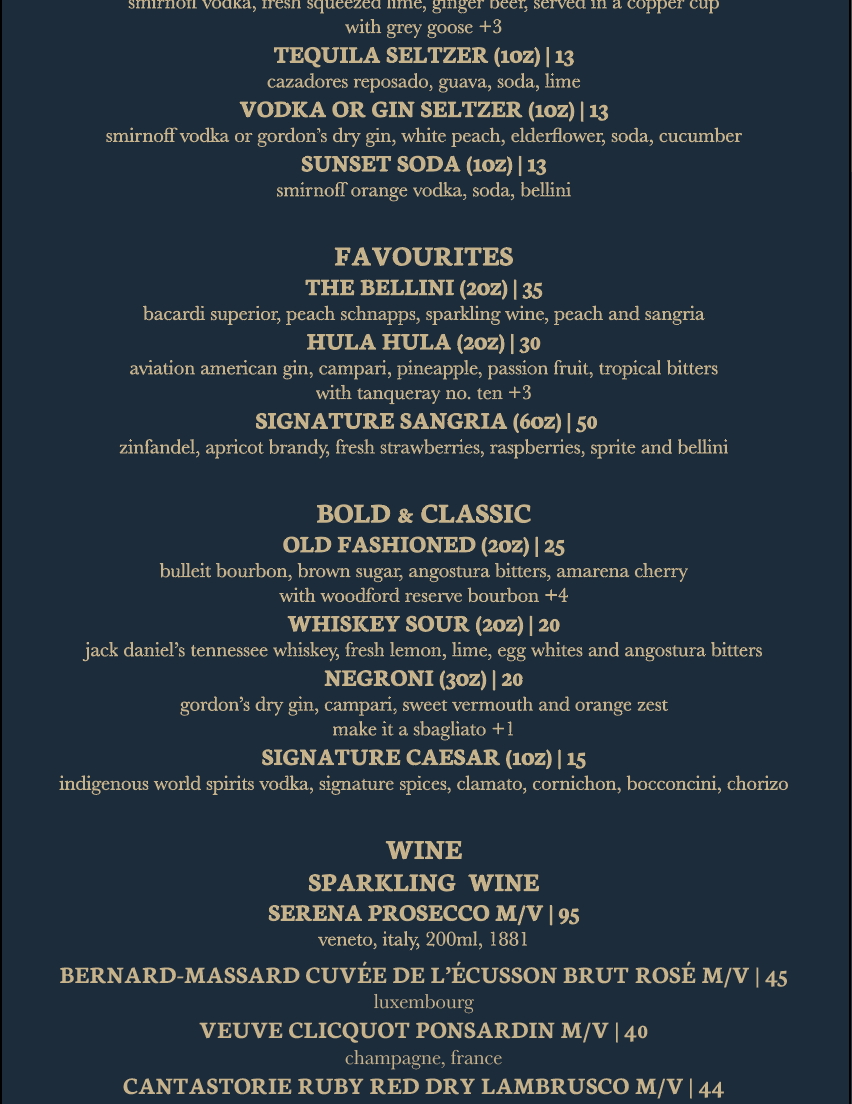
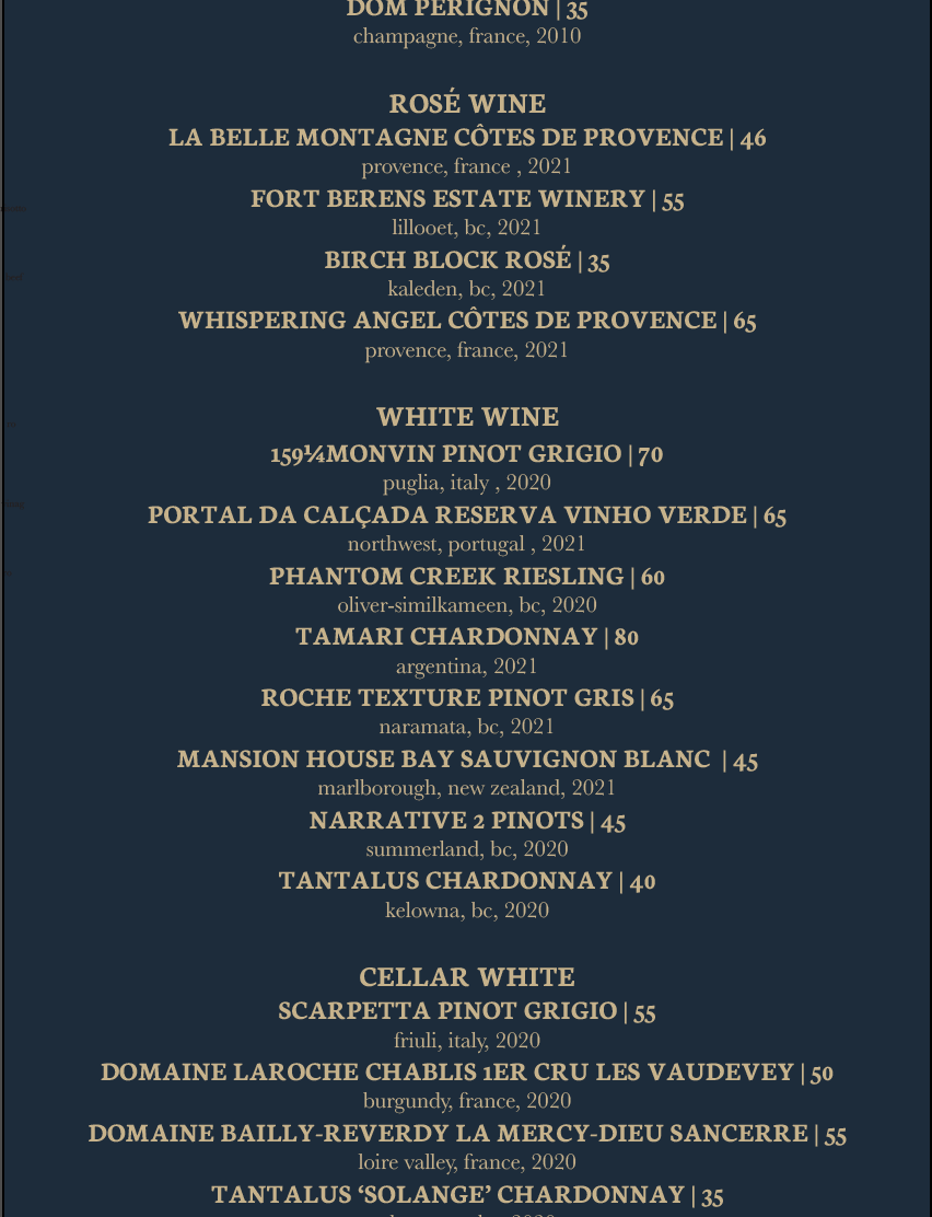
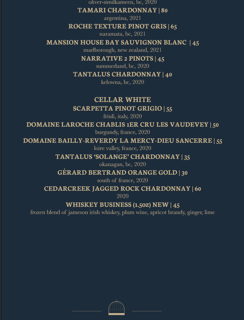
Drink Menu (Double-Sided) - 5.5 x 11in
The design is consistent with the printed menu. The logo is placed on the bottom of the drink menu to show where the drink menu ends.
iPad Menu -1536 x 2048 px
The deep blue was added to the background of the iPad scroll to prevent eye-strain since this is a dimly lit restaurant. The blue also creates feelings of calm and relaxation as customers browse through the menu. The logo is placed on the bottom of the drink menu to show where the drink menu ends.
Mockups