Introduction
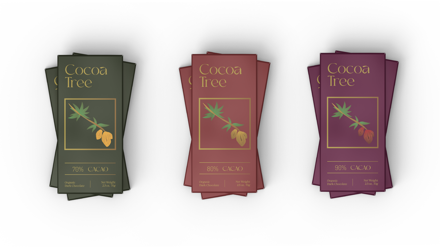
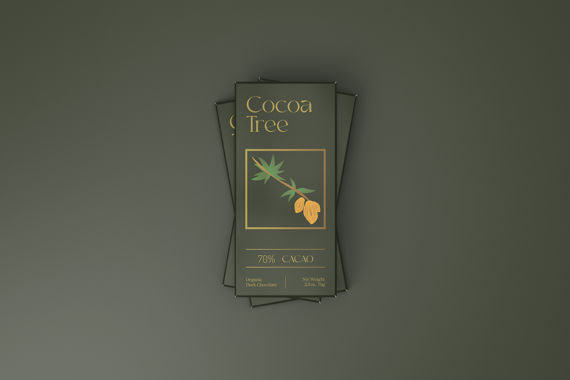
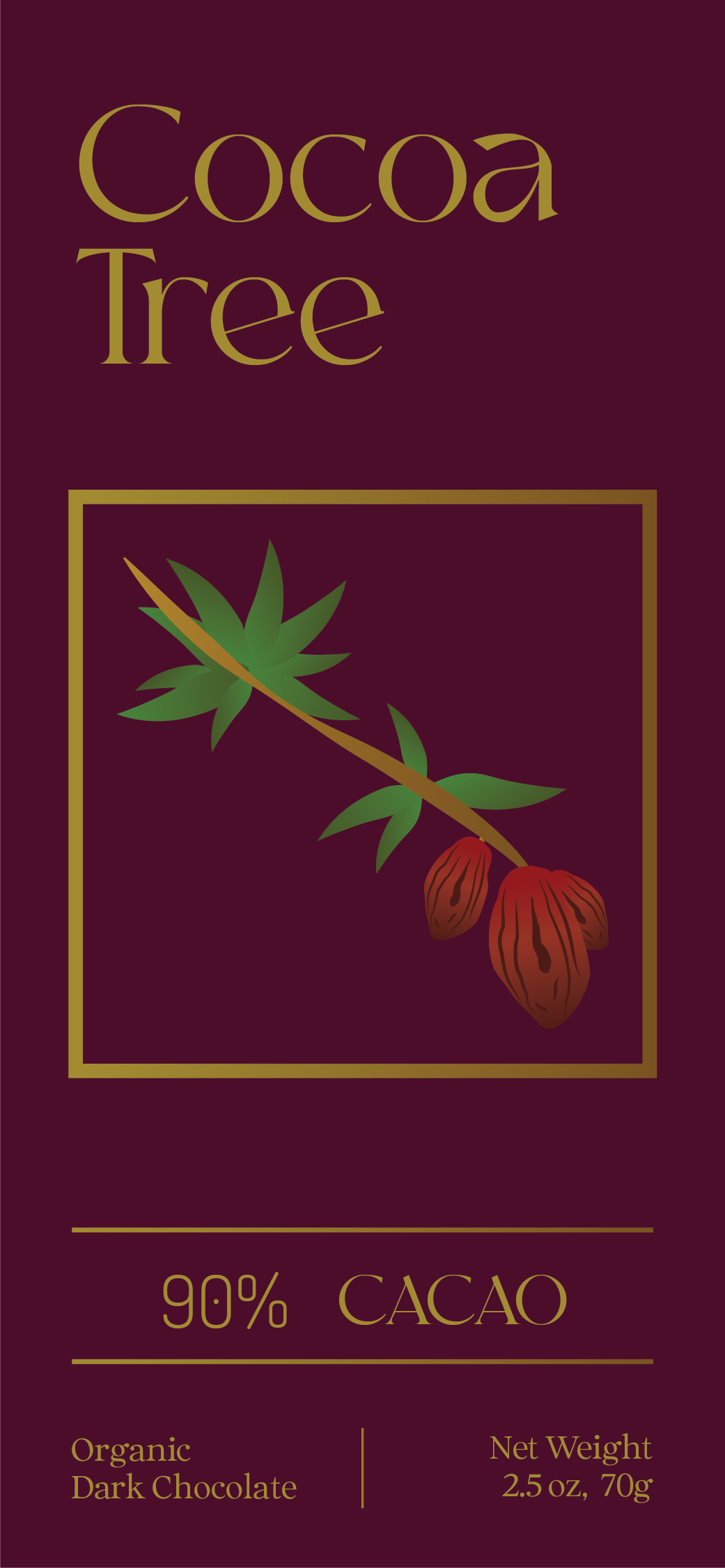
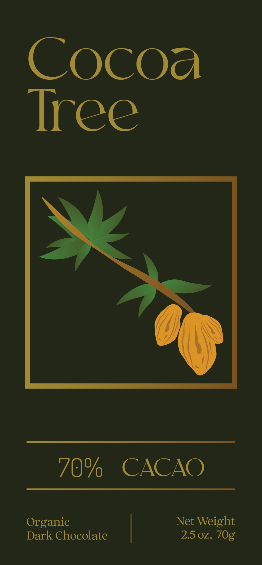
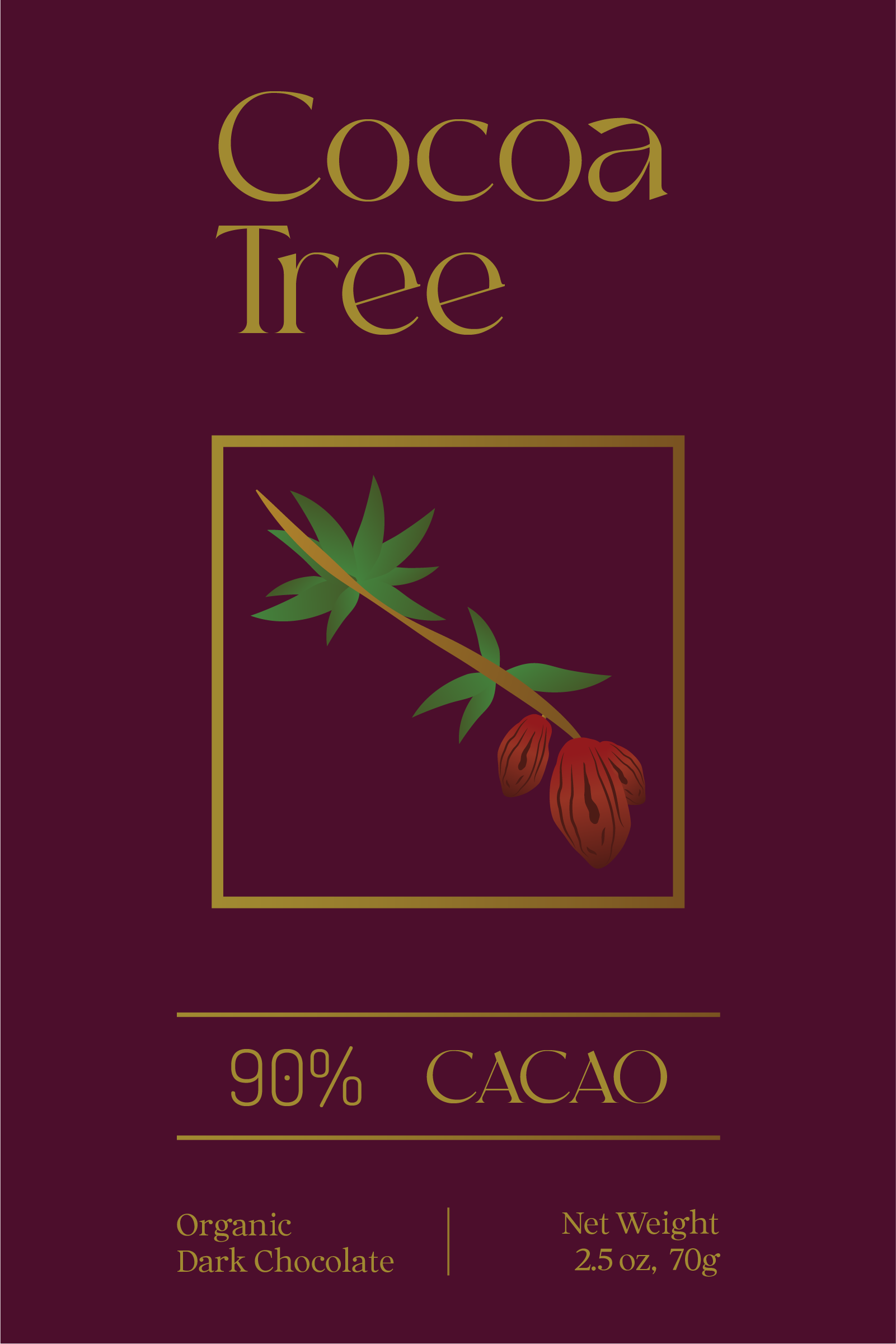
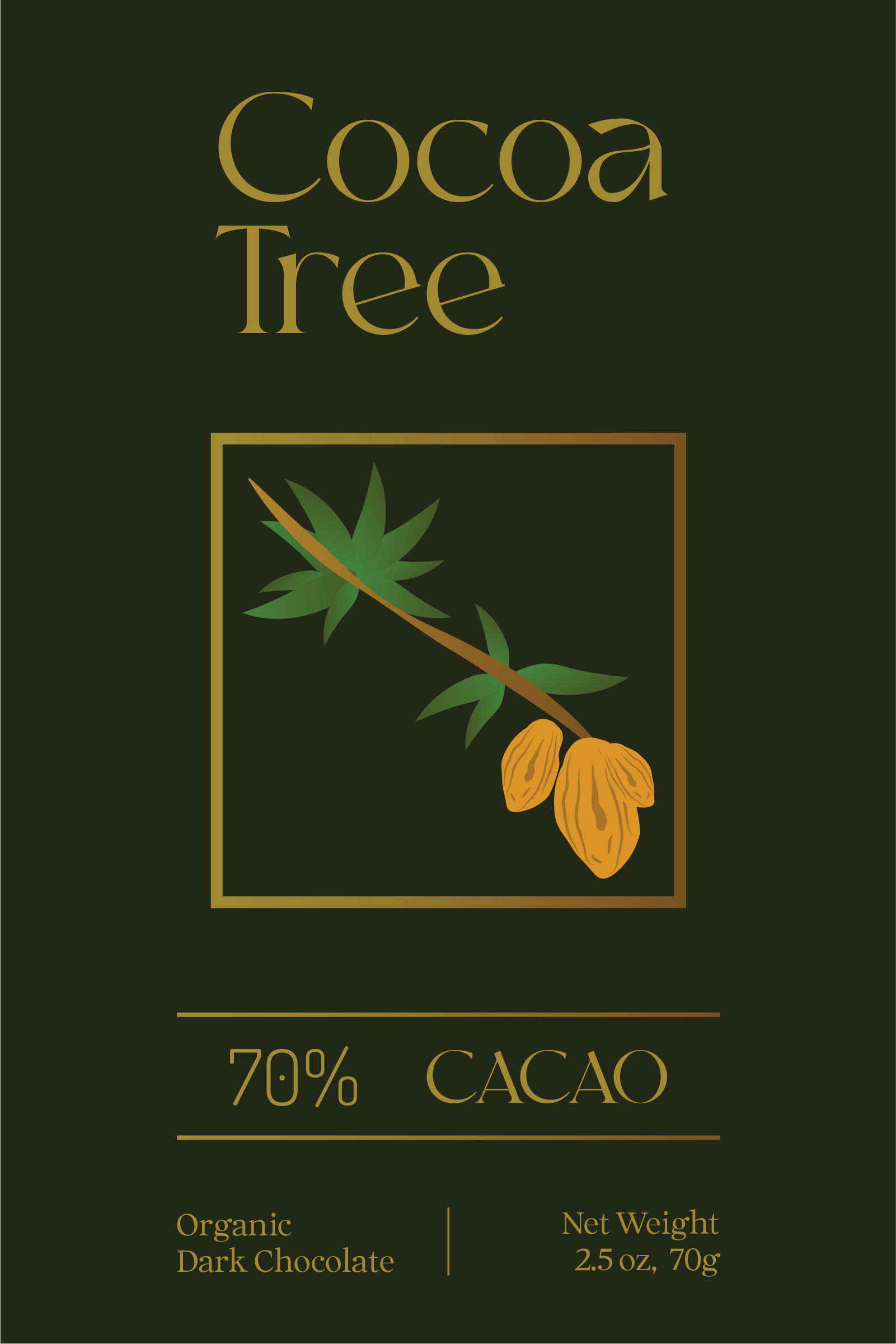
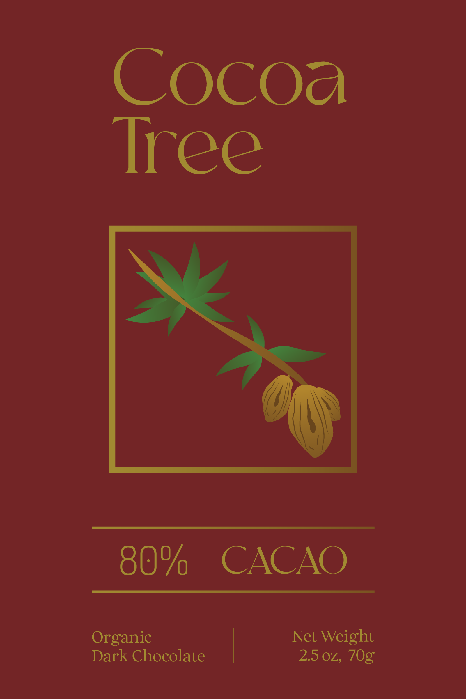
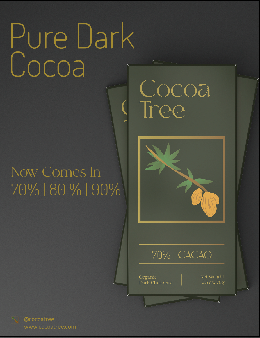
This chocolate brand is earthy, healthy, and organic. The three versions are 70%, 80%, and 90%. The colours chosen are deeper shades and that is meant to showcase the earthy and organic aesthetic of the product. The fonts chosen are MoglanDemo and Dosis Light. The tagline is "Nothing But Pure Cocoa" and the logo is the cacao branch used in all of the packaging. The software Illustrator was used for the design and Photoshop was used for the mockups.
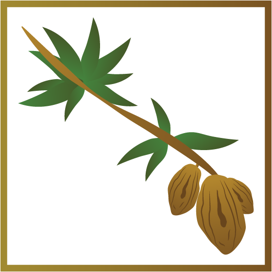
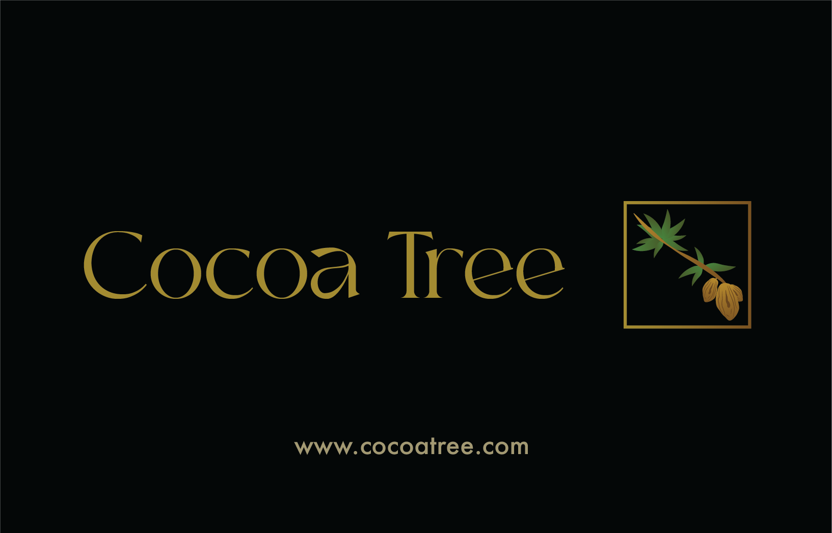
Logo
The logo is a cacao branch to symbolize the organic and natural product the brand produces.
Chocolate Bar Flats - 3.49 x 7.49 in
The goal was to make the three version of chocolate be different enough to stand out as its own flavour and still be associated with the brand. This was attempted by keeping the alignment, graphics font size, colour, and typeface the same throughout all of the bars. The subtle differences in each bar that make it unique to its flavour is the percentage, colours of the bar and the cacao illustrations.

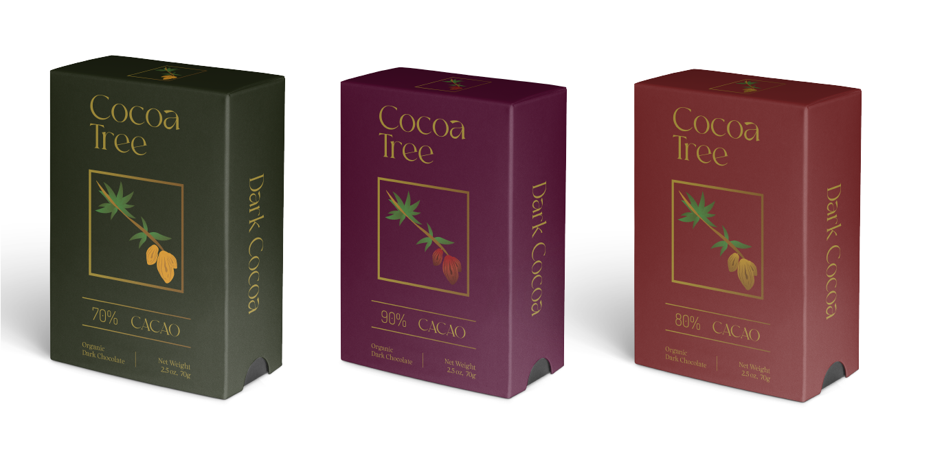
Chocolate Box Flats 5.3 x 8in
The same design is applied to the boxes. The only difference is the negative space on both sides of the boxes.
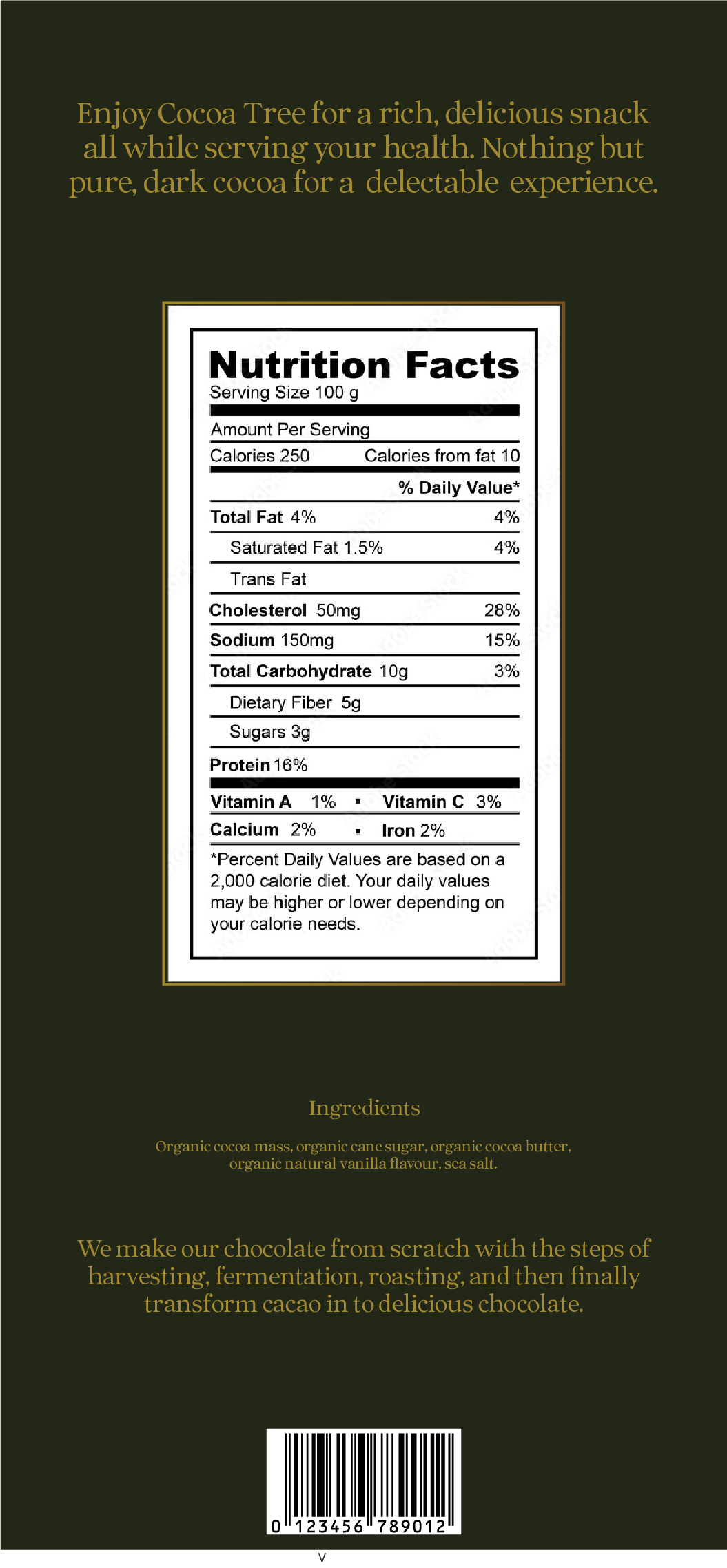
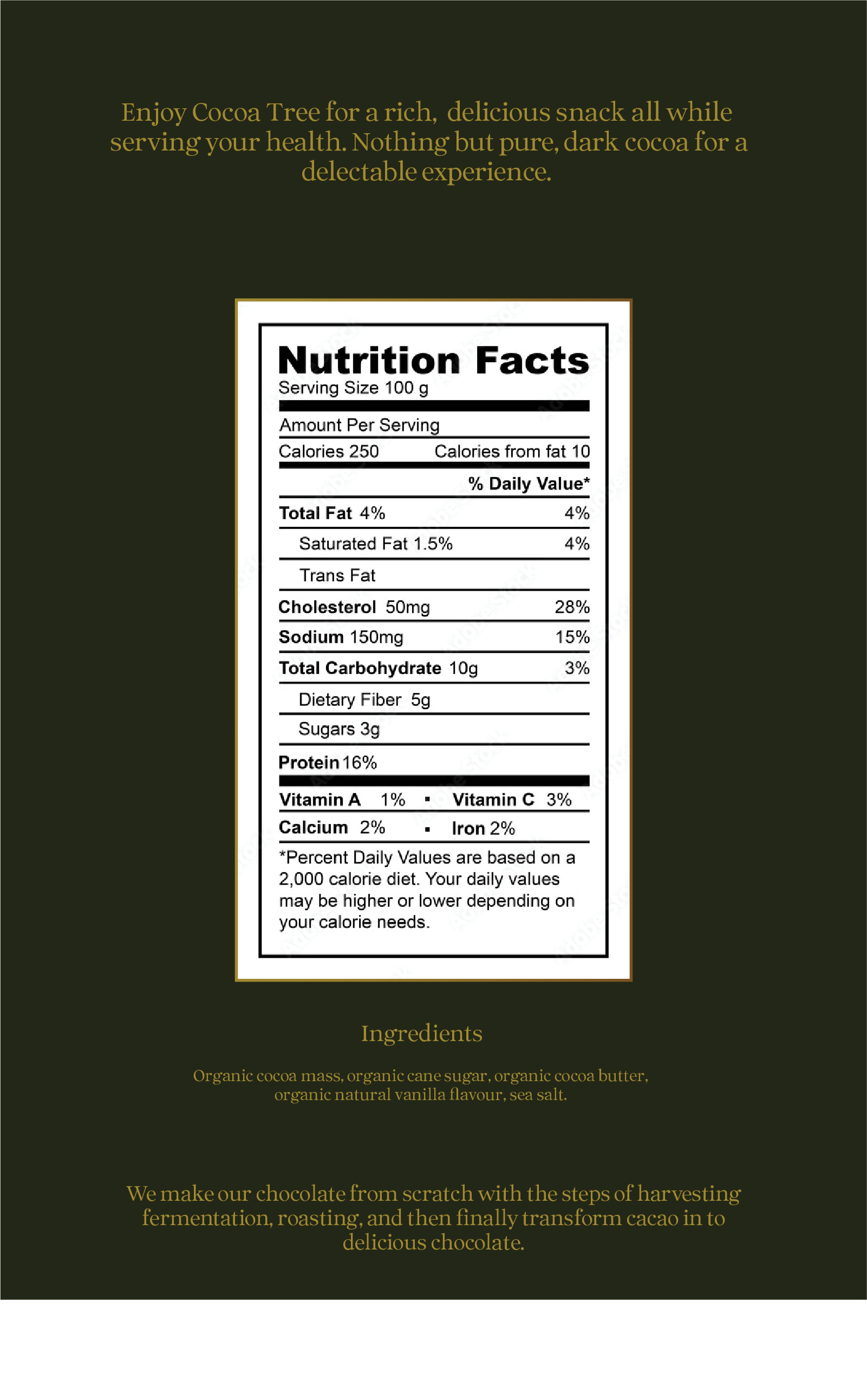
Nutritional Facts
This is the back of all the boxes and bars of the chocolate. The font colour and size are kept the same for a level of consistency. The entire design is aligned to the centre to create balance.

Business Cards - 389.52 x 251.496 pt
The contact information in is in the Futura font for legibility and to create a clean look.

Print Ad (left) - 8.5 x 11in | Digital Ad (right) 1080 x 1080px
The gold font is kept the same to maintain consistency and for it to be associated with the chocolate bar.

Mockups